from matplotlib import pyplot as plt
%matplotlib inline11 Basic Plotting
Creating plots is an important task in science and engineering. The old adage “A picture is worth a thousand words!” is wrong…. it’s worth way more than that if you do it right. When making plots of functions on a computer it is important to remember that computers don’t plot functions, rather they plot individual points. Only when you connect those points does the image look like the function you are used to seeing. In this chapter we will use a library called matplotlib for plotting. More specifically, we will import the pyplot function inside of matplotlib. It is customary to use plt as an alias for pyplot.
The %matplotlib inline statement is a Jupyter notebook command. It tells Jupyter to display any plots generated directly in the notebook instead of in a separate window. If you use matplotlib in another environment, you should remove this line and instead place plt.show() after the plot commands.
11.1 Plotting Functions of a Single Variable
In order to make a plot, matplotlib needs lists of the x and y coordinates for the points that are going to be plotted. If you want to plot a function, the list of x coordinates should be chosen to be a dense array of points spanning the function’s domain and the list of y coordinates should be the function values at those points. A good choice for generating the x-coordinates is either linspace or arange from NumPy. Let’s consider an example. The function shown below is called the Lennard-Jones equation and it gives the energy of two atoms interacting as a function of separation distance
\[ E = 4\sigma\left[ \left({\epsilon\over r} \right)^{12} - \left({\epsilon\over r} \right)^{6}\right]\]
Let’s plot this function from \(0.9\) to \(4.0\).
from matplotlib import pyplot as plt
%matplotlib inline
from numpy import linspace,sqrt

sigma = 1
epsilon = 1
r = linspace(0.9,4,20)
energy = 4 * sigma* ((epsilon/r)**12 - (epsilon/r)**6)

plt.figure()
plt.plot(r,energy)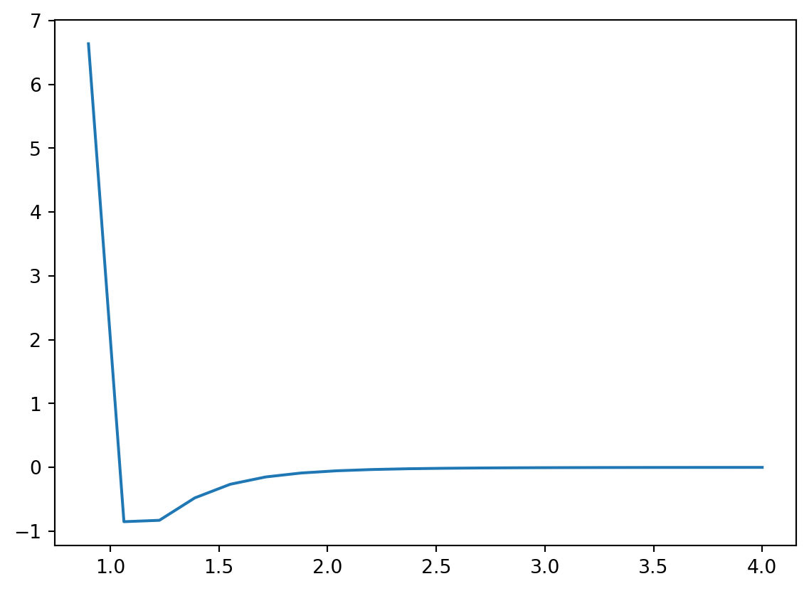
To Do:
- You may have noticed that the plot doesn’t appear very smooth. Think about what modifications you might make so that the plot is smoother.
- Run the code to verify that you did it correct.
11.1.1 Linestyles, Markers, and Colors
Three optional arguments can help you control the look of the plot: marker, linestyle, and color. All of these arguments take strings. The linestyle argument determines if the line is solid or dashed and what type of dashing to use. The marker argument specifies the shape of the plot marker to be used. Below are tables listing possible options for these arguments.
| Argument | Description |
|---|---|
o |
circle |
* |
star |
p |
pentagon |
^ |
triangle |
s |
square |
| Argument | Description |
|---|---|
- |
solid |
-- |
dashed |
-. |
dash-dot |
: |
dotted |
| Argument | Description |
|---|---|
b |
blue |
r |
red |
k |
black |
g |
green |
m |
magenta |
c |
cyan |
y |
yellow |
Several other keyword arguments exist for helping you customize the look of your plots. They are summarized in the table below.
| Argument | Description |
|---|---|
linestyle or ls |
line style |
marker |
marker shape |
linewidth or lw |
line width |
color or c |
line color |
markersize or ms |
marker size |
Here is the plot from above with some of these keyword arguments added.
from matplotlib import pyplot as plt
%matplotlib inline
from numpy import linspace,sqrt

r = linspace(0.9,4,50)
energy = 4 * ((1/r)**12 - (1/r)**6)

plt.figure()
plt.plot(r,energy,linestyle = '-', marker = 'o', color = 'r')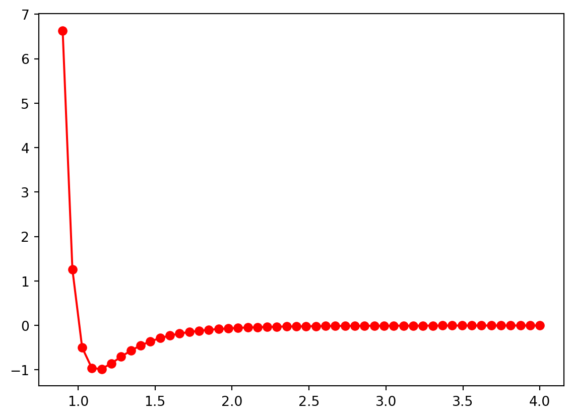
11.1.2 Labeling Plots
All good plots have axes labels and a title and you can add them to a matplotlib plot using the xlabel(), ylabel(), and title() functions which are placed on their own line after the plot command.
from matplotlib import pyplot as plt
%matplotlib inline
from numpy import linspace,sqrt

r = linspace(0.9,4,50)
energy = 4 * ((1/r)**12 - (1/r)**6)

plt.figure()
plt.plot(r,energy,marker = 'o')
plt.xlabel("Separation Distance")
plt.ylabel("Energy")
plt.title("Lennard-Jones Potential")
Text(0.5, 1.0, 'Lennard-Jones Potential')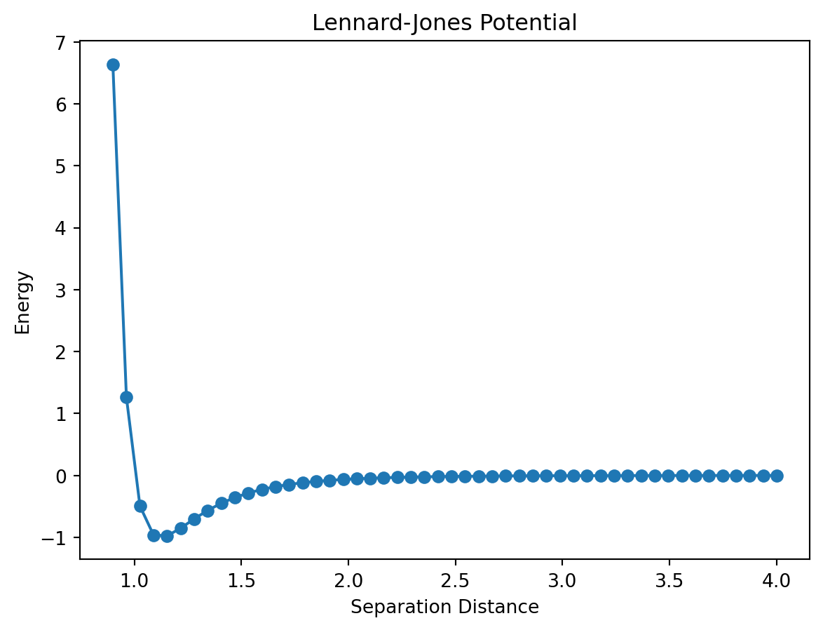
11.1.3 Greek Letters
In physics, Greek letters get used all the time and you may find yourself wanting to use one in a plot title or axes label. This can be accomplished by placing an r in front of the title string and then placing the name of the greek variable inside of $ with a backslash in front of it. This is better illustrated with an example.
from matplotlib import pyplot as plt
%matplotlib inline
from numpy import linspace,sqrt

r = linspace(0.9,4,50)
energy = 4 * ((1/r)**12 - (1/r)**6)

plt.figure()
plt.plot(r,energy,marker = 'o')
plt.xlabel("Separation Distance")
plt.ylabel("Energy")
plt.title(r"Lennard-Jones Potential ($\theta$)")
Text(0.5, 1.0, 'Lennard-Jones Potential ($\\theta$)')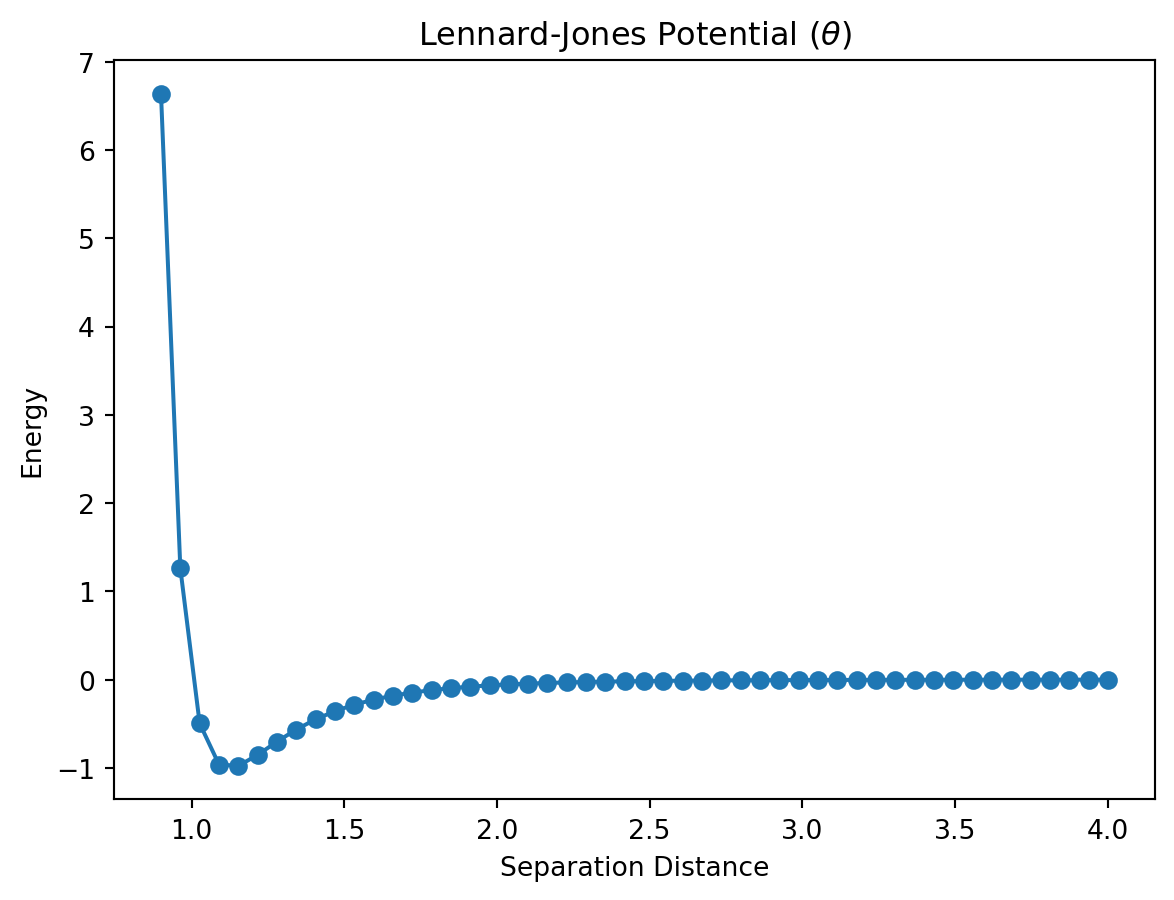
You can subscript any character using the _ character followed by the subscript. \(\theta_1\) can be written as \theta_1. If the subscript is more than one character, you’ll need to enclose it in curly braces. \(\theta_{12}\) is written as \theta_{12}. Superscripts work the same way only using the ^ character instead of the underscore.
| Argument | Description |
|---|---|
| \(\alpha\) | \alpha |
| \(\beta\) | \beta |
| \(\gamma\) | \gamma |
| \(\delta\) | \delta |
| \(\epsilon\) | \epsilon |
| \(\phi\) | \phi |
| \(\theta\) | \theta |
| \(\kappa\) | \kappa |
| \(\lambda\) | \lambda |
| \(\mu\) | \mu |
| \(\nu\) | \nu |
| \(\pi\) | \pi |
| \(\rho\) | \rho |
| \(\sigma\) | \sigma |
| \(\tau\) | \tau |
| \(\xi\) | \xi |
| \(\zeta\) | \zeta |
11.1.4 Controlling the Axes
By default, matplotlib will size the plot window to include all of the points. If you want to zoom in our out, you can do so with the xlim and ylim functions. These functions should be placed after the plot command on their own line just like the label commands.
from matplotlib import pyplot as plt
%matplotlib inline
from numpy import linspace,sqrt

r = linspace(0.9,4,50)
energy = 4 * ((1/r)**12 - (1/r)**6)

plt.figure()
plt.plot(r,energy,marker = 'o')
plt.xlim(0.5,3)
plt.ylim(-1.25,5)
plt.xlabel("Separation Distance")
plt.ylabel("Energy")
plt.title("Lennard-Jones Potential")
Text(0.5, 1.0, 'Lennard-Jones Potential')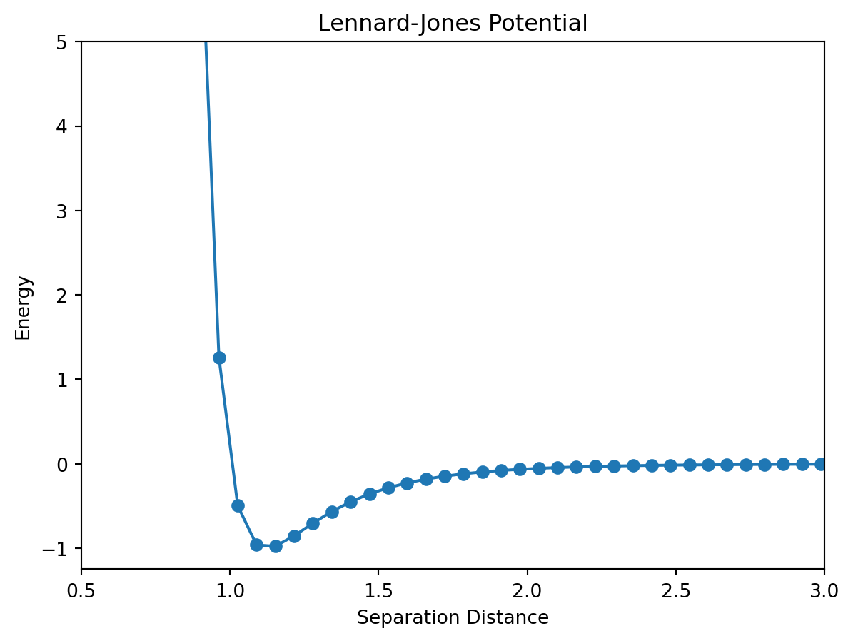
11.1.5 Overlaying Plots
Often you will want to plot more than one set of data on the same set of axes. This can be accomplished two ways. The first way is to call the plot function twice in the same Jupyter notebook cell. Matplotlib will automatically place the plots on the same figure and scale it appropriately. Below you will find a plot of the Lennard-Jones potential for two choices of the parameters \(\sigma\) and \(\epsilon\).
from matplotlib import pyplot as plt
%matplotlib inline
from numpy import linspace,sqrt

r = linspace(0.9,4,50)

sigmaOne = 1
epsilonOne = 1
sigmaTwo = 2
epsilonTwo = 2
energyOne = 4 * sigmaOne* ((epsilonOne/r)**12 - (epsilonOne/r)**6)
energyTwo = 4 * sigmaTwo * ((epsilonTwo/r)**12 - (epsilonTwo/r)**6)

plt.figure()
plt.plot(r,energyOne,marker = 'o')
plt.plot(r,energyTwo,marker = '+')
plt.xlim(0.5,3.5)
plt.ylim(-2,5)
plt.xlabel("Separation Distance")
plt.ylabel("Energy")
plt.title("Lennard-Jones Potential")
Text(0.5, 1.0, 'Lennard-Jones Potential')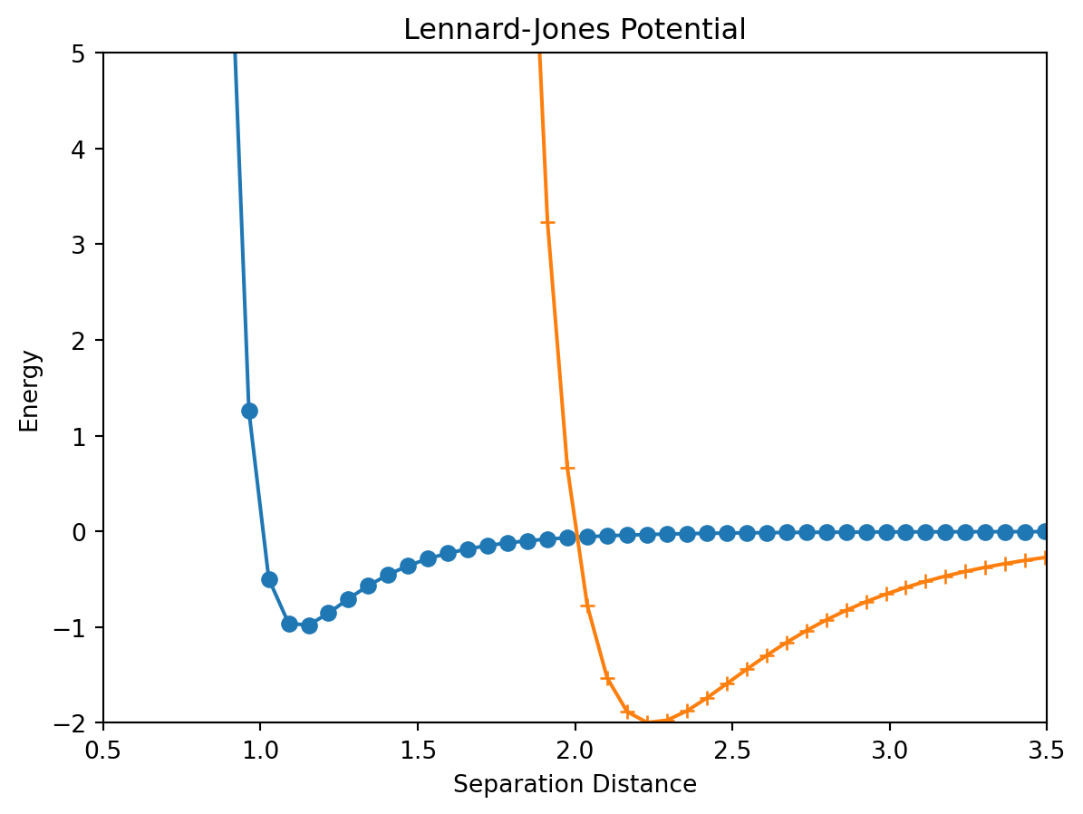
The other way to overlay plots is to include both sets of data into a single plot command.
from matplotlib import pyplot as plt
%matplotlib inline
from numpy import linspace,sqrt

r = linspace(0.9,4,50)

sigmaOne = 1
epsilonOne = 1
sigmaTwo = 2
epsilonTwo = 2
energyOne = 4 * sigmaOne* ((epsilonOne/r)**12 - (epsilonOne/r)**6)
energyTwo = 4 * sigmaTwo * ((epsilonTwo/r)**12 - (epsilonTwo/r)**6)

plt.figure()
plt.plot(r,energyOne,r,energyTwo,marker = 'o')
plt.xlim(0.5,3.5)
plt.ylim(-2,5)
plt.xlabel("Separation Distance")
plt.ylabel("Energy")
plt.title("Lennard-Jones Potential")
Text(0.5, 1.0, 'Lennard-Jones Potential')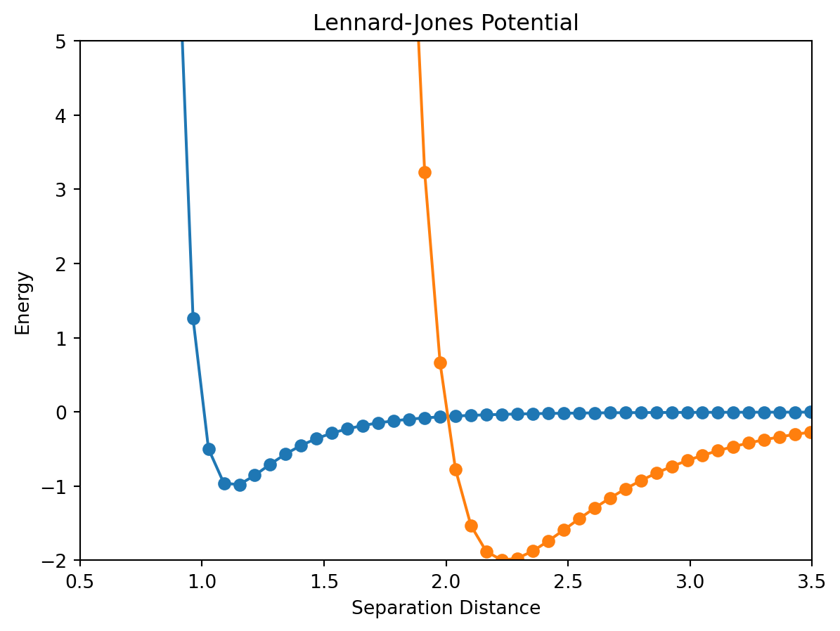
11.1.6 Plot Legends
Often when your figure contains more than one plot, it is helpful to include a plot legend to label the plots. To add a legend, each plot must be a separate command. In each plot command, the keyword argument label should be used to specify the plot’s label. To add the legend, use the command pyplot.ledend() after the plot commands. An example is given below:
from matplotlib import pyplot as plt
%matplotlib inline
from numpy import linspace,sqrt

r = linspace(0.9,4,50)

sigmaOne = 1
epsilonOne = 1
sigmaTwo = 2
epsilonTwo = 2
energyOne = 4 * sigmaOne* ((epsilonOne/r)**12 - (epsilonOne/r)**6)
energyTwo = 4 * sigmaTwo * ((epsilonTwo/r)**12 - (epsilonTwo/r)**6)

plt.figure()
plt.plot(r,energyOne,marker = 'o',label = "plot1")
plt.plot(r,energyTwo,marker = 'x',label = "plot2")
plt.xlim(0.5,3.5)
plt.ylim(-2,5)
plt.xlabel("Separation Distance")
plt.ylabel("Energy")
plt.title("Lennard-Jones Potential")
plt.legend()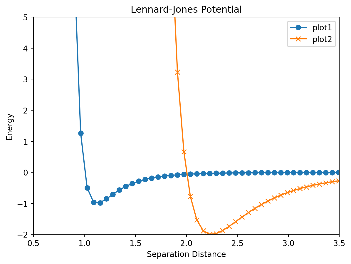
11.2 Other Plot Types
Beyond the line plot that we learned about in the previous section, matplotlib can generate many other types of plots that are very useful in a scientific setting. We’ll explore some of them here.
11.2.1 Logarithmic Plots
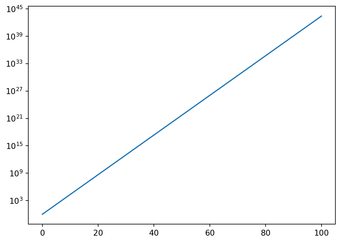
Sometimes the function being plotted increases or decreases by many orders of magnitude and a normal linear plot would not be particularly useful. Logarithmic plots can be made with the use of the semilogx, semilogy, or loglog functions depending on which axes you want to be on a logarithmic scale. Consider the first plot produced below. Notice that it rises from \(0\) at \(x = 0\) to \(10^{45}\) at \(x = 100\). Plotting this function with the y-axis scaled logarithmically will smooth out the plot and make it easier to analyze.
from matplotlib import pyplot as plt
%matplotlib inline
from numpy import linspace,exp

x = linspace(0,100,200)
y = exp(x)

plt.figure()
plt.plot(x,y)
plt.figure()
plt.semilogy(x,y)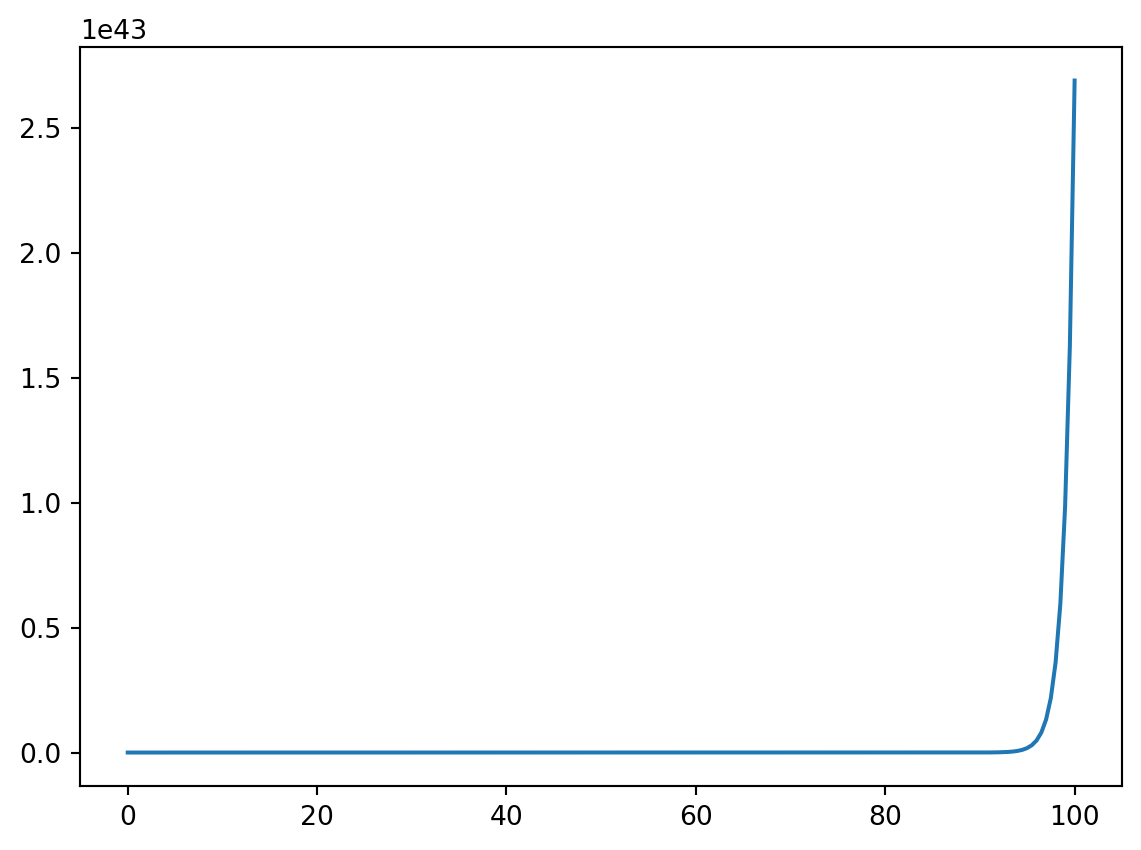
11.2.2 Scatter Plots
We have already generated scatter plots using the plot function but you can also use the scatter command to do the same thing. The only other additional functionality with scatter is the ability to specify the color, shape, and size of each plot marker individually.
from matplotlib import pyplot as plt
%matplotlib inline
from numpy import linspace,log

d = [5.8e10,1.9e11,1.5e11,2.3e11,7.8e11,1.4e12,2.9e12,4.5e12]
#d = [1,2,3,4,5,6,7,8]
T = [0.241,0.615,1,1.88,11.9,29.5,84,165]
mass = [3.2e23,4.9e24,6e24,6.4e23,1.9e27,5.7e26,8.7e25,1e26]

plt.figure()
plt.scatter(d,T,c = mass,s= 50)
plt.xlabel("Orbital Distance from Sun")
plt.ylabel("Length of day (in earth days)")
plt.title("Length of day for planets in our solar system (color indicates mass)")
plt.colorbar()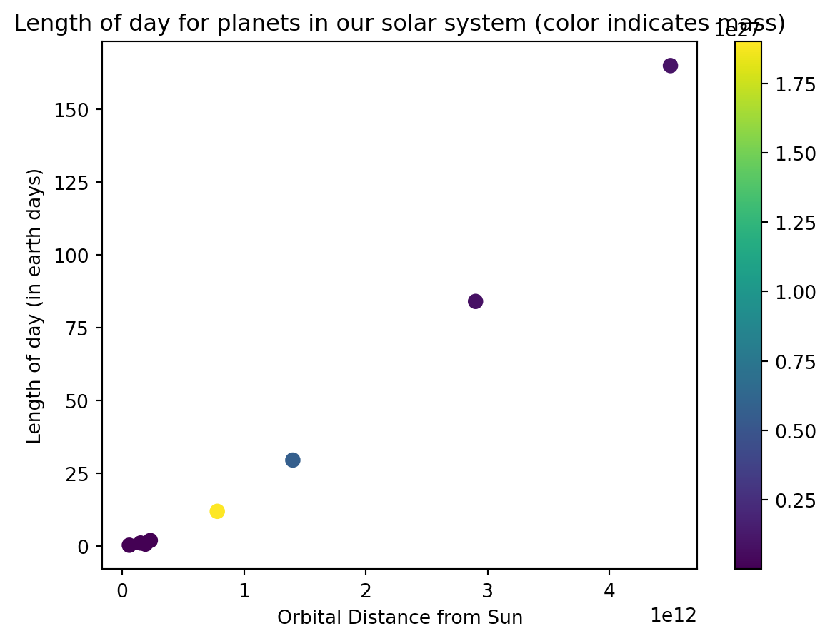
11.2.3 Bar Plots
A bar plot and a scatter plot are quite similar except that instead of a plot marker indicating the associated value, the height of the bar represents the value. You can make a bar plot using the bar function inside of pyplot.
from matplotlib import pyplot as plt
%matplotlib inline
from numpy import linspace,sqrt

#d = [5.8e10,1.9e11,1.5e11,2.3e11,7.8e11,1.4e12,2.9e12,4.5e12]
d = [1,2,3,4,5,6,7,8]
T = [0.241,0.615,1,1.88,11.9,29.5,84,165]

plt.figure()
plt.bar(d,T,tick_label = ["Mercury","Venus","Earth","Mars","Jupyter","Saturn","Uranus","Neptune"])
plt.xlabel("Planet Name")
plt.ylabel("Length of day (in earth days)")
plt.title("Length of day for planets in our solar system")
Text(0.5, 1.0, 'Length of day for planets in our solar system')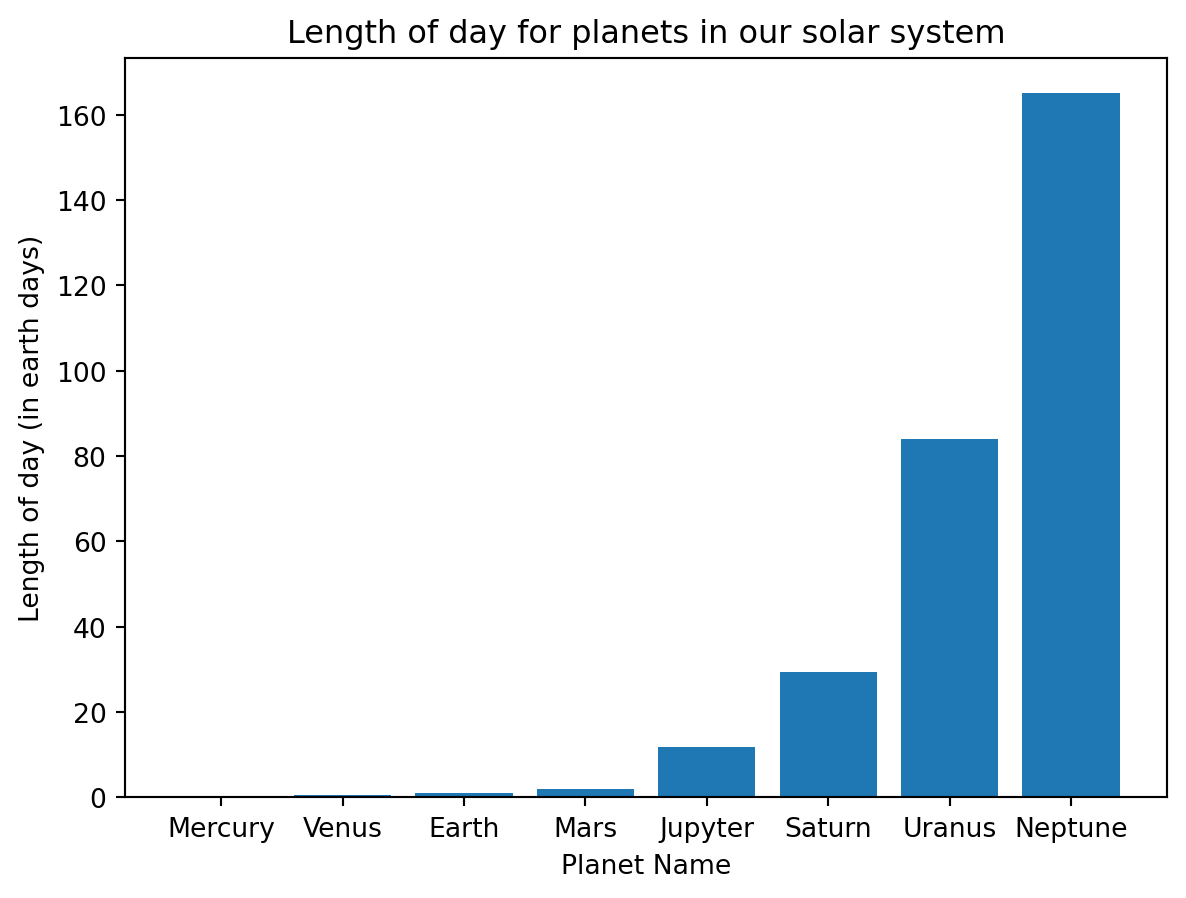
Notice the optional argument tick_label used to add labels to the bars. If that were left off, the bars would be labeled using the numbers supplied. Other optional arguments that are available for the bar command are given below.
| Argument | Description |
|---|---|
width |
bar width |
color |
bar color |
xerr |
X error bar |
yerr |
Y error bar |
capsize |
size of caps on error bars |
11.2.4 Errorbar Plots
To make plots with error bars use matplotlilb’s errorbar function. You can choose to add error bars on the x or y axis using the keyword arguments xerr and yerr.
from matplotlib import pyplot as plt

from numpy import arange

x = arange(0,8,0.5)
y = x**2

x_err = 0.05 # Same error for all points
y_error = 2 # Different error for each point

plt.errorbar(x,y,linestyle = '-.', marker = 'o',markersize = 3,yerr=y_error,capsize = 5)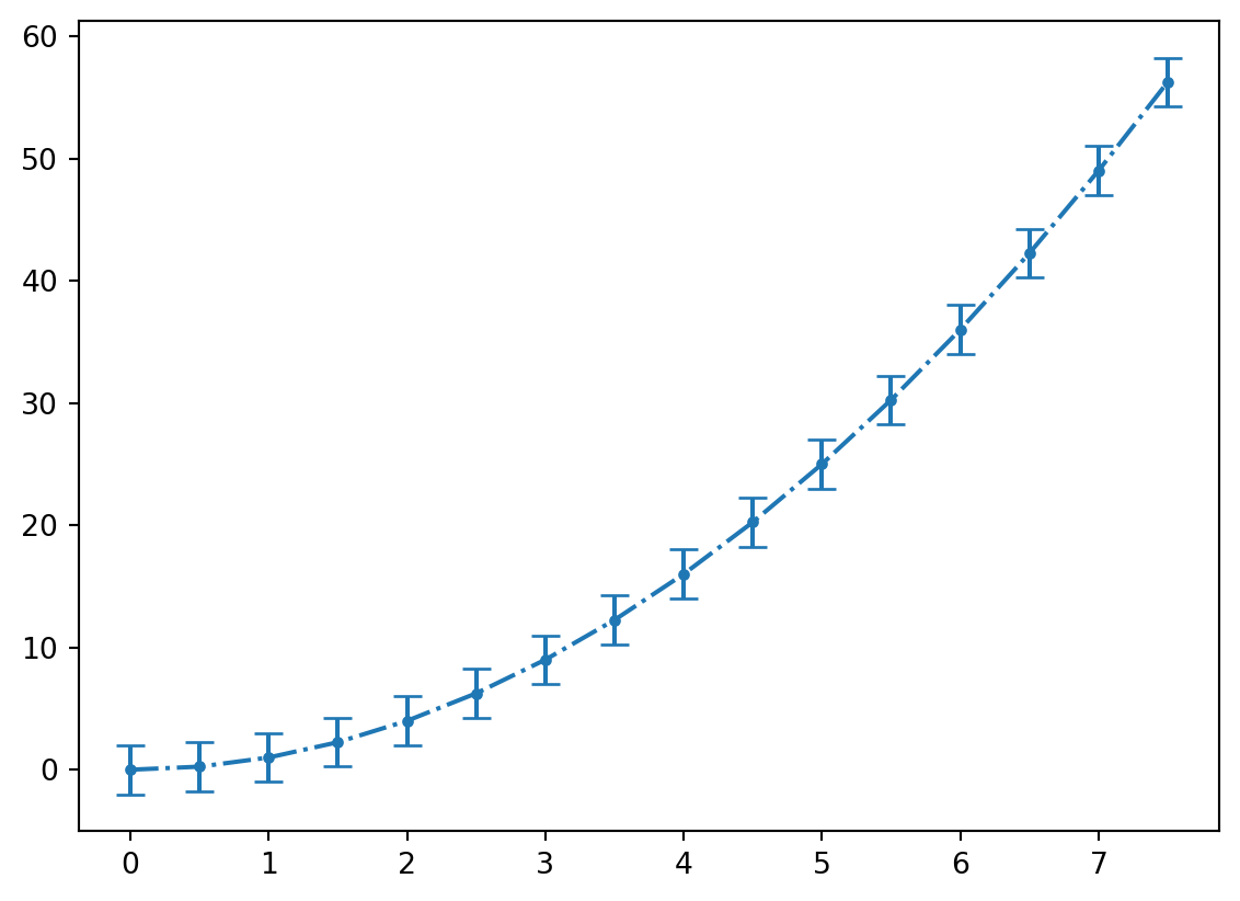
The linestyle, marker, and markersize arguments work with this plot type also.
11.2.5 Histograms
Histograms display bars representing the frequency of values in a given data set. Unlike bar plots, the width of the bar is meaningful since the each bar represents the number of x-values that fall within a range given by the width of the bar. A histogram can be constructed using the hist function. There is only one required argument, which is the data set. Some commonly used keyword arguments are bins which specifies how many equally-spaced groups (called bins) to generate and edgecolor which can be used to specify the color of the bar’s edges.
from matplotlib import pyplot as plt
%matplotlib inline
from numpy import linspace,log

densities = [0.00009,0.000178,0.00125,0.001251,0.001293,0.001977,0.534,0.810,0.900,0.920,0.998,1.000,1.03,1.03,1.25,1.600,1.7,2.6,2.7,3.5,5.515,7.8,7.8,8.6,8.5,11.3,13,13.6,18.7,19.3,21.4,22.4,22.6]

plt.figure()
plt.hist(densities,bins = 5,edgecolor = 'r')
plt.xlabel("Material Densities")
plt.title(r"Histogram of Material Densities (g/cm$^3$)")
Text(0.5, 1.0, 'Histogram of Material Densities (g/cm$^3$)')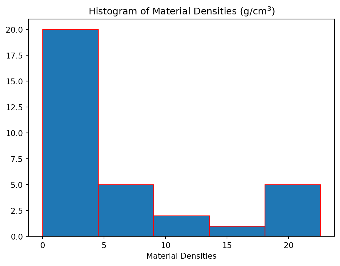
Here we have used bins = 5 which will produce a histogram with \(5\) equal-size bins. Alternatively, we can specify the exact locations of all the bin edges by placing them in a list.
from matplotlib import pyplot as plt
%matplotlib inline
from numpy import linspace,log

densities = [0.00009,0.000178,0.00125,0.001251,0.001293,0.001977,0.534,0.810,0.900,0.920,0.998,1.000,1.03,1.03,1.25,1.600,1.7,2.6,2.7,3.5,5.515,7.8,7.8,8.6,8.5,11.3,13,13.6,18.7,19.3,21.4,22.4,22.6]

plt.figure()
plt.hist(densities,bins = [0,2.5,5,7.5,10,12.5,15,17.5,20,22.5],edgecolor = 'r')
plt.xlabel("Material Densities")
plt.title(r"Histogram of Material Densities (g/cm$^3$)")
Text(0.5, 1.0, 'Histogram of Material Densities (g/cm$^3$)')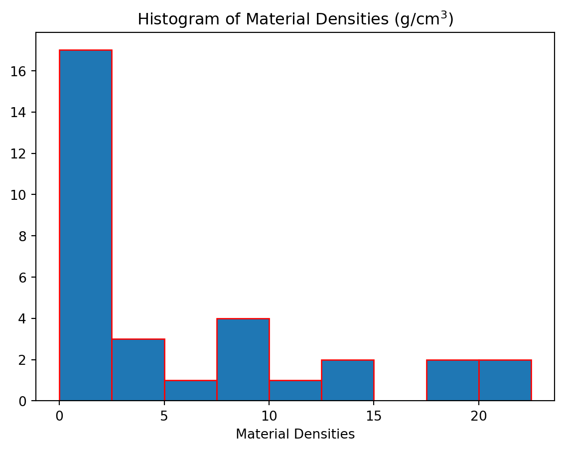
11.2.6 Polar Plots
In a polar plot instead of providing \((x,y)\) coordinates, you provide \((r,\theta)\) coordinates, where \(r\) is the radial distance from the origin and \(\theta\) is the angular location on the unit circle.
from matplotlib import pyplot as plt
%matplotlib inline
from numpy import linspace,pi,sin

theta = linspace(0,4 * pi,150)
r = sin(2* theta)

plt.figure()
plt.polar(theta,r)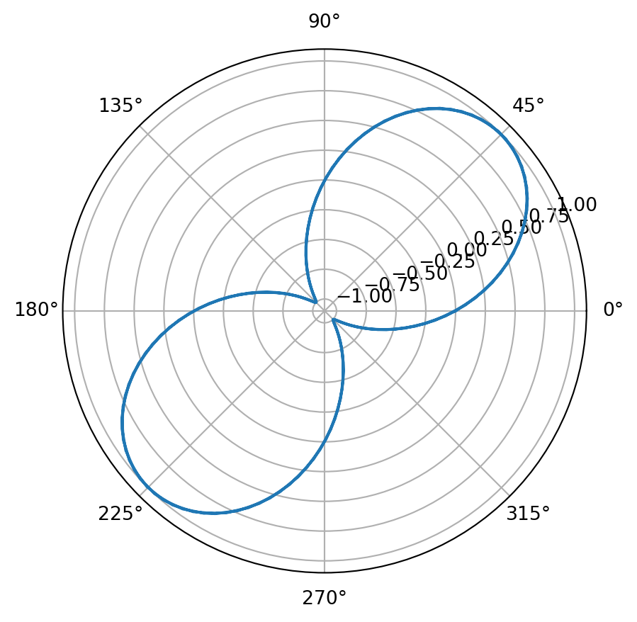
11.3 Multifigure Plots
To generate multiple, independent plots in the same figure a few more lines of code are necessary to specify how you want the plots arranged. We start with the figure function which generates the canvas upon which the plots will appear. Assign this object to a variable so you can refer to it later. To create each subplot, the fig.add_subplot(rows,columns, plot_number) function is used. There are three arguments to this function; the first two indicate the shape of the grid and the third indicates which position on the grid this plot will be assigned.
fig.add_subplot(rows,columns,plot_location)After the axes object has been created, we can call the plot function again, and a plot will be generated at its location. Here is an example that will generate two plots side by side.
from matplotlib import pyplot as plt
%matplotlib inline
from numpy import linspace,sqrt

r = linspace(0.9,4,50)

sigmaOne = 1
epsilonOne = 1
sigmaTwo = 2
epsilonTwo = 2
energyOne = 4 * sigmaOne* ((epsilonOne/r)**12 - (epsilonOne/r)**6)
energyTwo = 4 * sigmaTwo * ((epsilonTwo/r)**12 - (epsilonTwo/r)**6)

fig = plt.figure()
ax1 = fig.add_subplot(1,2,1)
ax2 = fig.add_subplot(1,2,2)

ax1.plot(r,energyOne,marker = '+',color = 'k')
ax1.set_xlim(0.5,3.0)
ax1.set_ylim(-1.5,5)
ax1.set_xlabel("Separation Distance")
ax1.set_ylabel("Energy")
ax1.set_title("Lennard-Jones Potential")

ax2.plot(r,energyTwo,marker = 'o',color = 'r')
ax2.set_xlim(0.5,4.0)
ax2.set_ylim(-2,5)
ax2.set_xlabel("Separation Distance")
ax2.set_ylabel("Energy")
ax2.set_title("Lennard-Jones Potential")
Text(0.5, 1.0, 'Lennard-Jones Potential')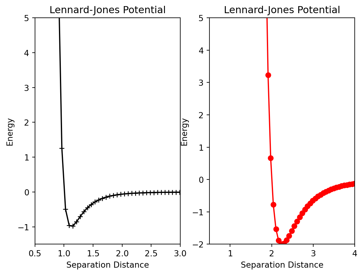
Pay close attention to the add_subplot function. ax1=add_subplot(1,2,1) will generate a \(1\) x \(2\) grid of plots and ax1 will correspond to the plot at the 1st location. Below is an example of a more advanced array of plots.
from matplotlib import pyplot as plt
%matplotlib inline
from numpy import linspace,sqrt

r = linspace(0.9,4,50)

sigmaOne = 1
epsilonOne = 1
sigmaTwo = 2
epsilonTwo = 2
energyOne = 4 * sigmaOne* ((epsilonOne/r)**12 - (epsilonOne/r)**6)
energyTwo = 4 * sigmaTwo * ((epsilonTwo/r)**12 - (epsilonTwo/r)**6)

fig = plt.figure()
ax1 = fig.add_subplot(2,1,1)
ax2= fig.add_subplot(2,2,3)
ax3 = fig.add_subplot(2,2,4)

ax1.plot(r,energyOne,marker = '+',color = 'k')
ax1.set_xlim(0.5,3.0)
ax1.set_ylim(-1.5,5)
ax1.set_xlabel("Separation Distance")
ax1.set_ylabel("Energy")
ax1.set_title("Lennard-Jones Potential")

ax2.plot(r,energyTwo,marker = 'o',color = 'r')
ax2.set_xlim(0.5,4.0)
ax2.set_ylim(-2,5)
ax2.set_xlabel("Separation Distance")
ax2.set_ylabel("Energy")
ax2.set_title("Lennard-Jones Potential")

ax3.plot(r,energyTwo,marker = 'o',color = 'r')
ax3.set_xlim(0.5,4.0)
ax3.set_ylim(-2,5)
ax3.set_xlabel("Separation Distance")
ax3.set_ylabel("Energy")
ax3.set_title("Lennard-Jones Potential")
plt.tight_layout()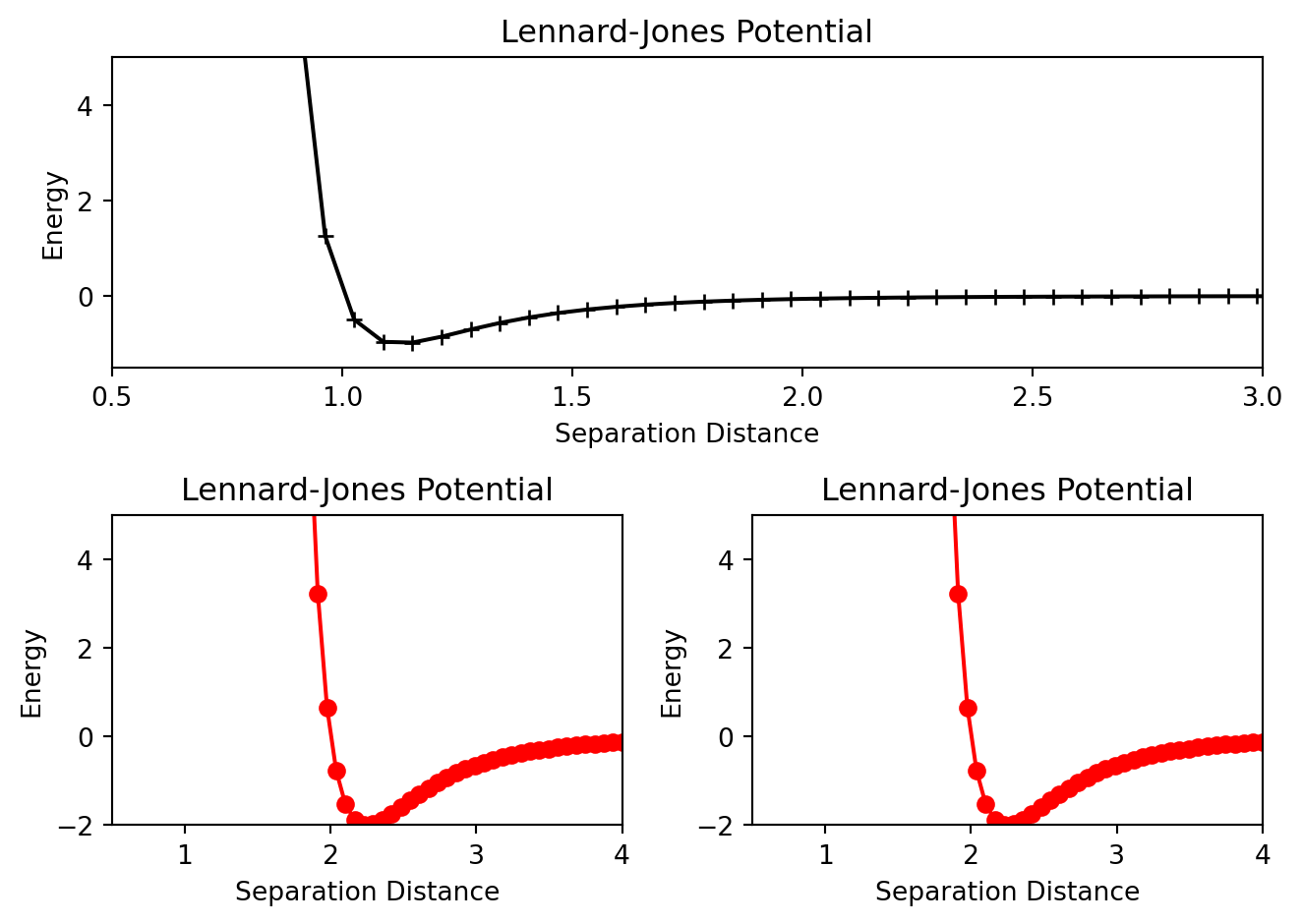
Also notice the set_xlim, set_ylim, set_xlabel etc methods that were used to customize each individual plot. There are a host of other methods available for further customization. This website has a comprehensive list of them.